 Français
 English
 العربية
 Bosanski jezik
 Čeština
 Dansk
Dansk Nederlands
 Wikang Filipino
 Suomi
Suomi Deutsch
 Magyar
 Íslenska
 Bahasa Indonesia
 Italiano
 日本語
日本語 한국어
한국어 Bahasa Melayu
 Polski
 Português
 Русский
 Cрпски језик
 Español
 ภาษาไทย
 Türkçe
 Tiếng Việt
L’emballage d’un spray d’ambiance n’est pas seulement une canette métallique ou un seau brillant : c’est le premier clin d’œil de votre produit dans l’allée.. En une fraction de seconde, les acheteurs évaluent: bon marché ou premium, sûr ou sommaire, ça vaut le coup ou passe difficile. Sur les marchés très fréquentés des produits chimiques et des parfums d’ambiance, l'emballage appuie sur la gâchette lors de l'achat.
McKinsey rapporte que plus 70% des décisions d'achat ont lieu en magasin, façonné par des repères visuels.
C'est le moment décisif. La sensation de votre valve, éclat de couleur, clarté de l'étiquette : chaque détail murmure la confiance… ou le doute. Faites les choses correctement, et les équipes d'approvisionnement s'appuient sur. Manquer la cible, et votre produit ramasse la poussière comme les restes de l’année dernière.
Aperçu rapide sur l’emballage des sprays d’ambiance
➔ Tirez parti des teintes vives et des combinaisons de couleurs contrastées pour un attrait instantané en rayon.
➔ Conception ergonomique, silhouettes empilables compatibles avec les seaux métalliques pour plus de polyvalence.
➔ Utilisez des fenêtres claires et de haute qualité, des étiquettes résistantes aux produits chimiques pour instaurer la confiance.
➔ Incorporate textural elements—matte varnish or soft-touch coatings—for a premium feel.
➔ Optimize finishes (brillant, mat, métallique) and bold typography to boost visibility and brand story.
7 Secrets To Eye-Catching Room Spray Packaging
Room spray packaging is not just a container; it shapes how people feel before the scent even hits the air. From spray bottle packaging to full room fragrance packaging systems, smart design boosts shelf pull and brand trust. Let’s break down how room spray packaging wins attention fast.

Secret 1: Leverage Vibrant Colors on Your Aerosol Cans
When designing room spray packaging, color drives instant reaction. Fort couleurs vibrantes sur bombes aérosols lift attrait visuel and align with your brand palette. Smart color psychology connects scent mood with buyer emotion.
Key performance comparison in spray bottle packaging color strategy:
| Color Tone | Consumer Recall Rate (%) | Purchase Intent (%) | Score de visibilité des étagères (1-10) | Trend Growth 2025 (%) |
|---|---|---|---|---|
| Citrus Orange | 78 | 64 | 9 | 12 |
| Vert forêt | 71 | 59 | 8 | 9 |
| Ocean Blue | 74 | 61 | 8.5 | 11 |
| Matte Black | 69 | 57 | 7.5 | 8 |
| Lavender Purple | 76 | 63 | 8.8 | 10 |
For room spray packaging:
- High contrast boosts recall.
- Saisonnier color trends refresh product lines.
- Consistent tones strengthen room fragrance packaging identity.
Brands like FANXUN fine-tune color layers so packaging spray products pop under retail lighting without looking loud.
Secret 2: Craft a Unique Bottle Shape with Metal Pails in Mind
Un intelligent unique bottle shape improves both vibe and logistics in room spray packaging.
- Define the container silhouette that stands out.
- Test ergonomic design for grip comfort.
- Check stacking fit with seaux en métal and outer cartons.
Under this process:
- Design Layer
- Distinctive curve for distinctive form
- Rapport hauteur/largeur équilibré
- Engineering Layer
- Contrôle de l'épaisseur des parois
- Géométrie de base stable
- Supply Layer
- Fit into secondary packaging
- Align with industrial filling lines
This packaging structure keeps spray packaging sleek yet warehouse-friendly.
Secret 3: Incorporate High-Quality Labels and Industrial-Grade Accessories
Room spray packaging speaks through touch and detail.
• Use high-quality labels with chemical-resistant label material.
• Upgrade personnalisation for sharp scent notes.
• Choose precise closure mechanisms et fort dispenser quality.
Dans les coulisses:
- Matériel
- Oil-resistant films
- Waterproof adhesives
- Matériel
- Industriel accessories
- Valve spring stability
- Performance
- À long terme durabilité
- Consistent spray mist
FANXUN focuses on spray bottle packaging that holds up in humid bathrooms, hotel rooms, and factory floors alike.
Secret 4: Use Clear Windows to Reveal the Fragrance Inside
Clear panels in room spray packaging create trust instantly.
✦ Clear windows augmenter product visibility.
✦ A subtle fragrance reveal shows off liquid color.
✦ Transparency builds sensory appeal before spraying.
Layered approach:
- Visual Trust
- Accurate fill-level display
- Clean internal clarity
- Emotional Trigger
- Color hints at scent mood
- Reinforces authenticity
- Retail Advantage
- Easier comparison on shelf
- Boosted impulse pickup
Room fragrance packaging that shows, not hides, often converts faster.
Secret 5: Add Textural Elements for a Premium Feel
Room spray packaging feels different when touch matters.
Soft-touch coatings add grip.
Subtil relâchement ou gaufrage gives depth.
Un lisse finition mate paired with tiny glossy accents sharpens contrast.
Flux de développement:
- Select surface base.
- Appliquer textural elements aligned with brand tone.
- Test real-hand tactile experience.
Premium room spray packaging doesn’t need flashy extras. Un contrôlé sensation premium often wins more loyalty than busy graphics.
Secret 6: Highlight Your Brand Story with Striking Typography
Typography carries the mood of room spray packaging.
- Striking typography shapes identity.
- Intelligent font selection booste legibility.
- Clair typeface hierarchy guides the eye.
Structurez-le comme ça:
- Couche de titre
- Nom de parfum audacieux
- Poids confiant
- Couche de détail
- Ingrédients
- Conseils d'utilisation
- Couche narrative
- Court histoire de la marque
- Crochet émotionnel
Une communication visuelle forte transforme un simple emballage en spray en un emballage de parfum d'ambiance mémorable.
Secret 7: Optimisez l’impact en rayon grâce à une finition d’emballage stratégique
L’éclairage des étagères change tout dans l’emballage des sprays d’ambiance.
2 chemins de finition clés:
- Haute brillance pour l'éclat.
- Mat doux pour un calme moderne.
Arbre de décision:
- Choix de finition
- Brillance → Réflexion lumineuse plus élevée
- Mat → Une élégance plus douce
- Métallisé → Luxe audacieux
- Hiérarchie visuelle
- Zone de logo en surbrillance
- Faible info secondaire
- Conception remarquable
- Casquette et corps contrastés
- Aligner avec fabrication objectifs.
Intelligent techniques de finition conduire réel attention du consommateur. FANXUN adapte la finition de l'emballage afin que chaque ligne d'emballage de spray d'ambiance ait un fort impact en rayon sans se sentir exagérée.
Emballage de spray d'ambiance avec un budget minimaliste
Intelligent emballage de spray d'ambiance ne doit pas vider votre portefeuille. Quand le parfum est solide, le vrai jeu réside dans la façon dont votre chambre, pulvérisation, et l'emballage travaillent ensemble. Un look épuré, choix de matériaux intelligents, et de petites modifications créatives peuvent donner à l'emballage du spray d'ambiance un aspect haut de gamme sans la facture effrayante.
Simplifier la conception: Des lignes épurées sur vos seaux métalliques
Lors de la mise en forme emballage de spray d'ambiance autour seaux en métal, la clarté gagne.
- Direction visuelle de base
- Esthétique minimaliste
- Couleurs de base neutres
- Typographie limitée
- Large espacement pour respirer
- Des lignes épurées
- Bordures droites
- Placement simple du logo
- Alignement équilibré
- Esthétique minimaliste
- Traitement de surface
- Finition élégante
- Revêtement mat pour un toucher doux
- Brillant léger pour une brillance subtile
- Couverture d’encre réduite pour réduire les coûts d’impression
- Finition élégante
- Focus sur la marque
- Fort identité de marque à travers une marque en gras
- Contrôlé attrait visuel utiliser une balance, pas de désordre
Une bonne conception d’emballage pour les emballages de spray d’ambiance est moins une question de décoration que de retenue.. Gardez-le net. Gardez-le calme.
Matériaux économiques: Affordable Aerosol Cans Without Sacrificing Quality
Économique bombes aérosols can still look legit in room spray packaging.
- Choose standardized sizes to simplify approvisionnement en matériaux.
- Confirm internal coatings meet safety rules for fragrance formulas.
- Request batch testing for assurance qualité et à long terme durabilité.
- Prioritize functionality
- Smooth spray valves
- Reliable sealing for daily use
Recent retail research from McKinsey noted that consumers continue trading toward “value-focused products that maintain perceived quality despite price sensitivity.”
“Shoppers are increasingly unwilling to pay premiums for packaging alone, but still expect durability and responsible material choices.” — McKinsey Global Packaging Report, 2024
That insight fits room spray packaging perfectly. Focus on perceived quality, not flash, and your spray packaging earns trust fast.
DIY Label Tricks: Des accessoires créatifs qui augmentent la valeur perçue
De petites améliorations peuvent transformer l'emballage du spray d'ambiance sans modifier la structure de base..
- Fondation du label
- Fort conception d'étiquettes
- Nom du parfum clair
- Slogan d'ambiance court
- En couches Étiquettes DIY
- Papier texturé
- Superpositions transparentes
- Fort conception d'étiquettes
- Ascenseur visuel
- Tampon en aluminium subtil pour amélioration visuelle
- Casquettes personnalisées comme accessoires créatifs
- Dessus à code couleur pour les familles de parfums
- Narration de marque
- De petites icônes comme éléments de marque
- Numéros de lot manuscrits pour personnalisation.
Ces ajustements soulèvent tranquillement valeur perçue. Emballage de spray d'ambiance, emballage par pulvérisation, même un simple emballage de pièce peut donner l'impression d'être une boutique avec la bonne touche. Restez intelligent, garde-le mince, et laisse le parfum parler.
5 Déclencheurs émotionnels que chaque paquet de pulvérisation doit toucher
Super emballage de spray d'ambiance n'est pas qu'un conteneur; c'est une ambiance. Des seaux métalliques aux bombes aérosols, smart spray packaging shapes how people feel before they even press the nozzle. Let’s break down how to hit those triggers.

Nostalgie: Vintage-Inspired Labels on Metal Pails
When customers pick up emballage de spray d'ambiance styled with vintage labels on seaux en métal, emotion kicks in fast. The pull of retro design et un classic aesthetic feels safe, familier, and oddly comforting.
For heritage-driven spray packaging projects, FANXUN often organizes design thinking like this:
- Identité visuelle
- Typographie
- Serif fonts with 1920s curves
- Handwritten scripts for craft appeal
- Color Direction
- Muted greens
- Dusty blues
- Warm cream tones
- Typographie
- Material Expression
- Embossed tin surfaces
- Matte varnish for a timeless appeal
- Brand Story
- Courte histoire d'origine imprimée près de la base
- Petites icônes de badge renforçant l'image de marque du patrimoine.
Selon Mintel 2025 Rapport sur les tendances mondiales de l'emballage:
« Les consommateurs associent de plus en plus les emballages d’inspiration rétro à l’authenticité et à une valeur perçue plus élevée du produit., en particulier dans les catégories de parfums d’intérieur.
Cette idée explique pourquoi emballage de spray d'ambiance avec un ton nostalgique attire souvent une meilleure attention en rayon.
Excitation: Des graphismes audacieux pour votre collection d’aérosols OEM
L'énergie fait vendre. Pour Lignes OEM, graphismes audacieux à travers bombes aérosols Créez un impact instantané sur n'importe quel présentoir de spray d'ambiance..
FANXUN structure le développement d'emballages par pulvérisation à fort impact en phases successives:
- Concept Étincelle
- Analyse des tendances
- Influence du street art
- Références à la culture pop
- Cartographie du profil cible
- Analyse des tendances
- Exécution de la conception
- Appliquer couleurs vibrantes
- Intégrer conceptions dynamiques avec typographie inclinée
- Test des visuels accrocheurs sous l'éclairage d'un magasin
- Simulation d'étagère
- Comparez les rapports de contraste
- Ajustez la saturation pour attrait moderne
Key performance snapshot from controlled retail testing:
| Design Type | Color Contrast % | Shelf Stop Rate % | Purchase Intent % |
|---|---|---|---|
| Minimal Matte | 35 | 42 | 38 |
| Retro Pattern | 48 | 57 | 51 |
| Neon Graphic | 72 | 76 | 68 |
| High-Gloss Urban | 81 | 83 | 74 |
Excitement isn’t random. It’s engineered inside smart emballage de spray d'ambiance decisions.
Confiance: Clear Ingredient Callouts for Industrial and Select Food Markets
Trust builds quietly but powerfully in emballage de spray d'ambiance, especially for industrial clients and regulated spaces.
FANXUN typically organizes compliance-driven spray packaging like this:
- Transparency Layer
- Complet ingredient list in readable font size
- Plain-language explanations
- Couche de sécurité
- Clear safety information icons
- Hazard classifications aligned with normes industrielles
- Couche de conformité
- Certification marks
- Notes on conformité réglementaire
- Label statements for food-grade packaging where required.
Add a short assurance line near the barcode reinforcing intégrité du produit, and buyers relax. Clean labeling doesn’t shout. It reassures.
Joy: Playful Icons and Color Pops on Your Packaging Accessories
Not every room spray package has to be serious. Some should smile back.
Dans accessory lines—caps, gift boxes, refills—FANXUN uses:
- playful icons
- Bright color pops
- Minuscule whimsical elements near the spray trigger
Development flow often looks like this:
- Define emotional tone: cute, audacieux, or artsy
- Select two primary vibrant accents
- Add one unexpected fun design detail
- Balance with neutral base to avoid overload
That mix turns standard emballage de spray d'ambiance into expressive packaging customers love to gift.
Confort: Soft Touch Finishes That Speak to Home and Hospitality
Comfort lives in the hand. A soft touch finish changes everything.
For hospitality industry focused emballage de spray d'ambiance, FANXUN refines tactile strategy in tiers:
- Ingénierie des surfaces
- Apply micro-textured matte coating
- Test friction level for optimal expérience tactile
- Visual Warmth
- Earth tones that align with décoration intérieure
- Subtle gradients supporting an inviting packaging sentir
- Premium Cue Integration
- Soft metallic logo stamp
- Minimalist layout reinforcing a sensation premium
- Positioning tailored to the needs of hotel guests.
Le résultat? A subtle luxury touch that makes guests feel at ease. Spray packaging becomes more than protection; it becomes part of the atmosphere.
Is Your Packaging Telling The Wrong Story?
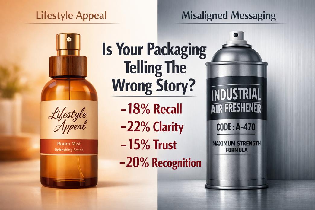
Ton emballage de spray d'ambiance might look polished, yet still miss the vibe your buyers expect. From industrial cans to lifestyle sprays, the way your packaging speaks can quietly boost—or hurt—brand trust and sales.
Misaligned Messaging: When Industrial Cans Look Too Clinical
Quand emballage de spray d'ambiance feels cold and clinical, it shifts brand perception in seconds. Buyers shopping for a cozy room spray don’t want something that looks like it belongs in a lab.
- Core disconnect often shows up in:
- Harsh metallic finishes that ignore product aesthetics
- Technical fonts overpowering visual cues
- Zero storytelling around the scent experience
Sous la surface, the issue usually sits deeper:
- Visual Tone
- Palette de couleurs
- Overuse of white and grey reduces attrait du consommateur
- Lack of warmth weakens emotional pull
- Typographie
- Industrial fonts clash with lifestyle-focused conception d'emballage
- Palette de couleurs
- Sensory Alignment
- If lavender is soft, le emballage de spray d'ambiance should echo calm.
- If citrus is energetic, the spray packaging needs punch.
- Market Expectation Shift
- Mintel’s 2025 home fragrance update noted that buyers increasingly link scent products with mood enhancement and décor styling, not just function.
“Home fragrance buyers now expect packaging to reflect lifestyle identity as much as scent performance.” — Mintel, 2025
Des marques comme FANXUN ajuster emballage de spray d'ambiance by balancing durability with warmth, so industrial strength doesn’t kill emotional connection.
Overcomplicated Artwork: Losing Clarity on Your Metal Pails
Crowded packaging artwork can tank brand recognition rapide. If buyers can’t read it in three seconds, c'est la fin du jeu.
Common red flags in spray packaging:
- Too many icons competing with conception d'étiquettes
- Faible hiérarchie des informations
- Decorative layers causing visual clutter
Here’s how complexity impacts clarity in industrial-style canettes de monotop used for emballage de spray d'ambiance:
| Facteur | Simple Design | Overloaded Design | Impact on Sales |
|---|---|---|---|
| Font Count | 1–2 | 4+ | -18% recall |
| Color Layers | 2–3 | 6+ | -22% clarté |
| Message Blocks | 3 key points | 8+ fragments | -15% confiance |
| Logo Visibility | High contrast | Blended background | -20% recognition |
Clair différenciation des produits wins. Sharp hierarchy. Bold logo. Clean scent callout.
A practical reset looks like this:
- Strip back to essentials.
- Rank details by buyer priority.
- Rebuild the emballage de spray d'ambiance around clarity, pas de décoration.
FANXUN keeps industrial metal surfaces clean while letting scent identity breathe, so the conception d'emballage supports the product instead of shouting over it.
Ignored Audience: Failing to Appeal to Both Chemical and Food-Grade Buyers
Dual markets complicate emballage de spray d'ambiance decisions. Industrial buyers check specs. Retail buyers check vibe. Miss either one, and growth stalls.
Key audience layers include:
- Technical Buyers
- Se concentrer sur conformité réglementaire
- Demand proof of sécurité des produits
- Examiner matériaux d'emballage
- Lifestyle Buyers
- Judge confiance des consommateurs through finish and print
- Expect elevated spray packaging aesthetics
- Associate look with scent quality
- Distributors
- Need dual-purpose packaging clarté
- Value easy market segmentation
Balancing both sides works best when:
- Industrial structure stays solid.
- Visual storytelling stays human.
- Safety messaging stays visible but not overwhelming.
Intelligent emballage de spray d'ambiance blends compliance and charm. The can holds chemicals safely. The exterior still feels shelf-ready.
That balance is where FANXUN stands out—engineering-grade durability wrapped in thoughtful packaging design that respects both chemical standards and lifestyle expectations.
Packaging Vs. Parfum: Which Drives Purchase?
When shoppers scan shelves or scroll online, emballage de spray d'ambiance often speaks before the scent does. The outer look, the bottle feel, even the spray sound set the mood fast. Toujours, the perfume inside decides if that first buy turns into a habit. In the world of room spray, packaging and fragrance constantly compete for attention.

Emballage
Dans le emballage de spray d'ambiance game, visual cues hit hard and fast.
- Visuel & Physical Appeal
- esthétique
- Color balance
- Faire le ménage conception d'étiquettes
- forme
- Slim cylinders
- Rounded edges for grip
- matériel
- Frosted glass
- Matte-coated bombes aérosols en aluminium
- esthétique
- Performance & Practicality
- fonctionnalité
- Fine mist sprayers
- Leak-proof caps
- durabilité
- Résistance aux rayures
- Drop-tested bidon d'huile moteur style robustness.
- fonctionnalité
- Market Influence
- Shelf impact in retail
- Scroll-stopping effect in e-commerce
- Brand memory linked to smart room spray bottle design
FANXUN focuses heavily on room spray packaging development, balancing bold esthétique with solid durabilité. Their approach to spray packaging blends striking forme choices and practical fonctionnalité, making room spray packaging feel less like a container and more like a lifestyle piece. In a crowded room spray market, smart room fragrance packaging can close the deal before anyone even smells the product.
Parfum
Toujours, scent keeps customers coming back.
- Core Scent Construction
- scent profile
- Fresh citrus
- Warm woody blends
- fragrance notes
- Top spark
- Base depth
- scent family
- Floral
- Oriental
- scent profile
- Mesures de performances
- longévité
- All-day freshness
- intensity
- Light mist
- Bold burst
- Dans l'ensemble arôme équilibre
- longévité
- Emotional Connection
- Memory-triggering olfactory experience
- Mood-setting arôme diffusion
- Signature scent recognition
FANXUN pairs refined perfume development with standout room spray packaging, ensuring the scent profile matches the promise made by the packaging for room spray. Fort longévité and balanced intensity turn a one-time purchase into repeat demand. À la fin, room spray packaging may spark the sale, but the perfume seals the relationship.
Pourquoi 80% Of Buyers Judge By Packaging
When shoppers scan shelves or scroll online, decisions happen fast. Dans le monde de emballage de spray d'ambiance, that snap judgment can make or break a sale. From spray packaging design to fragrance packaging details, small visual cues speak loudly. Smart brands treat room spray packaging like a silent salesperson—always on duty.
First Impressions: The Impact of Aerosol Can Aesthetics
In room spray packaging, visual appeal starts with structure and flows into detail.
- Can Shape
- Slim cylinders feel modern and easy to grip.
- Wider bodies suggest strength and long-lasting spray.
- Custom silhouettes instantly separate your spray bottle packaging from copycats.
- Color Palette
- Soft neutrals hint at calm, spa-style scents.
- Bold tones energize and grab attention in crowded aisles.
- Gradient blends add depth to fragrance packaging without overdoing it.
- Graphic Design & Typographie
- Faire le ménage conception graphique paired with sharp typographie improves readability.
- Oversized scent names guide quick decisions.
- Balanced spacing boosts overall visual appeal.
- Finition & Conception du couvercle
- Mat finition feels smooth and understated.
- Glossy coatings reflect light and pop on shelves.
- Un serré, well-shaped conception du couvercle signals care in spray packaging production.
“Packaging remains one of the top drivers of trial in home fragrance categories,” notes Mintel’s 2025 Rapport sur les tendances mondiales de l'emballage, highlighting that visual design directly influences first-time purchases.
Brands like FANXUN refine every layer of room spray packaging so the look matches the scent promise.
Perceived Quality: How Metal Pail Finishes Signal Value
Buyers often test weight before price. That subtle lift shapes perception fast.
- Metal Finish & Texture
A brushed metal finish gives a cool, refined touch. Add subtle texture, and the product feels crafted, not mass-made.
- Durabilité & Poids
Heavier pails suggest durabilité. Un solide poids reassures customers that the packaging spray system inside is protected.
- Premium cues that elevate room spray packaging:
- Thick walls
- Even edges
- Coutures propres
Lacquer Coating & Gaufrage
Un lisse revêtement de laque protects graphics from scratches. Lumière relâchement adds depth you can feel. That tactile moment creates a true sensation premium, especially in high-end spray bottle packaging lines.
When room spray packaging feels sturdy, shoppers are more comfortable paying a higher price. It’s simple psychology.
Brand Credibility: Accessories and Labels That Build Trust
Trust grows from details most people don’t consciously notice—yet always judge.
- Label Material
- Waterproof films prevent peeling in humid bathrooms.
- Thick stock signals investment in quality room spray packaging.
- Printing Quality & Information Clarity
- Crisp printing quality keeps scent descriptions readable.
- Clear ingredients and safety notes improve information clarity.
- Usage directions
- Storage advice
- Contact details
- Logo Placement & Instruction Design
- Centered logo placement strengthens recall.
- Faire le ménage instruction design avoids clutter in fragrance packaging layouts.
- Security Seals & Barcode Readability
- Serré security seals prevent tampering.
- Pointu barcode readability ensures smooth retail scanning.
Room spray packaging that checks all these boxes builds long-term confidence. FANXUN aligns accessories, spray packaging components, and labeling standards so brands look reliable from day one—and stay that way.
FAQ
How do vibrant colors affect room spray packaging sales?
Color speaks before scent does.
- Bright tones catch the eye on crowded retail and industrial shelves.
- Clear contrast separates fragrance lines for OEM bulk buyers.
- Consistent color coding simplifies warehouse picking and repeat orders.
In fast-moving wholesale environments, visual clarity builds trust at a glance.
Why are metal pails used in chemical and industrial room spray packaging?
Metal pails balance strength and practicality.
- Resistant to solvents and pressure changes.
- Stackable for export pallets.
- Suitable for food-grade or chemical formulations.
For distributors handling large OEM contracts, durability reduces leakage risks and shipping claims—saving cost and reputation at once.
What makes high-quality labels critical for aerosol cans?
A label is not decoration; it is a promise.
- Moisture-resistant coatings prevent peeling in humid storage.
- Sharp typography improves compliance visibility.
- Strong adhesive survives long-distance transport.
Poor printing can even expose system-style errors during mockup previews, such as clean execution protects brand credibility.
How do transparent windows improve buyer confidence?
A small clear panel can change perception instantly.
Buyers see:
- Liquid color
- Fill level
- Product authenticity
In hospitality supply chains and private-label exports, that visibility feels honest and reduces hesitation during bulk purchase decisions.
Which finishes enhance the perceived quality of room spray packaging?
Finish defines mood and market position.
| Type de finition | Visual Effect | Buyer Impression |
|---|---|---|
| Mat | Doux, modern | Premium lifestyle |
| Brillant | Light-catching | High shelf impact |
| Métallique | Reflective strength | Industrial durability |
The right surface turns a simple aerosol can into a product people want to pick up—and reorder.
Références
- McKinsey & Entreprise: In-Store Purchasing Decisions and Visual Cues – mckinsey.com
- Psychology Today: Color Psychology and Consumer Behavior – psychologytoday.com
- Industrial Designers Society of America (IDSA): Principles of Ergonomic Packaging – industrialdesign.org
- Solutions UL: Standards for Chemical-Resistant Labeling – ul.com
- NielsenIQ: The Role of Transparency and Product Visibility in Retail – nielseniq.com
- Smithers: Textural Elements and Tactile Experience in Premium Packaging – smithers.com
- Forbes: Visual Communication and Brand Identity in Luxury Goods – forbes.com
- Shopify: Minimalist Packaging Design Trends for E-commerce – shopify.com
- Mintel: 2025 Tendances mondiales de l’emballage et perspectives des consommateurs – mintel.com
- Journal de publicité: La psychologie du branding rétro et de la nostalgie – journalofadvertising.org
- Administration de la sécurité et de la santé au travail (OSHA): Normes de communication des dangers et de sécurité – osha.gov
- Magazine d'hébergement: Tendances d'emballage dans l'industrie hôtelière – hébergementmagazine.com
- EPA: Normes d’emballage durable et de recyclabilité des métaux – epa.gov
- Changement: Analyse du marché des parfums d’intérieur et de style de vie de luxe – skift.com
- Homme d'État: Mesures de confiance des consommateurs et de qualité des emballages – statista.com