 한국어
한국어 English
 العربية
 Bosanski jezik
 Čeština
 Dansk
Dansk Nederlands
 Wikang Filipino
 Suomi
Suomi Français
 Deutsch
 Magyar
 Íslenska
 Bahasa Indonesia
 Italiano
 日本語
日本語 Bahasa Melayu
 Polski
 Português
 Русский
 Cрпски језик
 Español
 ภาษาไทย
 Türkçe
 Tiếng Việt
룸 스프레이 포장은 단순한 금속 캔이나 반짝이는 통이 아닙니다. 제품이 통로를 가로지르는 첫 번째 윙크입니다.. 순간에, 구매자는 크기를 조정: 저렴하거나 프리미엄, 안전하거나 대략적인, 그만한 가치가 있거나 하드 패스. 혼잡한 화학제품 및 가정용 향수 시장, 포장은 구매 시 방아쇠를 당깁니다..
McKinsey는 다음과 같이 보고합니다. 70% 구매 결정이 매장 내에서 이루어지는 비율, 시각적 단서에 의해 형성됨.
그것이 성패의 순간입니다. 밸브 느낌, 컬러팝, 라벨 명확성 - 각 세부 사항은 신뢰 또는 의심을 속삭입니다.. 제대로 해봐, 조달팀이 참여하고 있습니다.. 마크를 놓치다, 작년에 먹다 남은 음식처럼 먼지가 쌓이는군요..
룸 스프레이 포장에 대한 빠른 통찰력
➔ 생생한 색상과 대비되는 색상 구성을 활용하여 즉각적인 진열 매력을 선사합니다..
➔ 인체공학적 디자인, 다용성을 위해 금속 통과 호환되는 쌓을 수 있는 실루엣.
➔ 투명창과 고품질의 창문을 사용하세요., 신뢰를 구축하는 내화학성 라벨.
➔ 고급스러운 느낌을 위해 질감 요소(무광택 바니시 또는 소프트 터치 코팅)를 통합합니다..
➔ 최적화 완료 (광택, 무광택, 금속성) 가시성과 브랜드 스토리를 높이는 대담한 타이포그래피.
7 눈길을 끄는 룸 스프레이 포장의 비밀
룸스프레이 포장은 단순한 용기가 아닙니다.; 향기가 공기에 닿기 전에 사람들이 느끼는 감정을 결정합니다.. 스프레이 병 포장부터 풀룸 향수 포장 시스템까지, 스마트한 디자인으로 진열대 견인력과 브랜드 신뢰도 향상. 룸 스프레이 포장이 어떻게 빠르게 주목을 받는지 분석해 보겠습니다..

비밀 1: 에어로졸 캔에 생생한 색상 활용
룸스프레이 포장을 디자인할 때, 컬러는 즉각적인 반응을 이끌어냅니다.. 강한 생생한 색상 ~에 에어로졸 캔 승강기 시각적 매력 그리고 당신의 브랜드 팔레트. 스마트 색상 심리학은 향기의 기분과 구매자의 감정을 연결합니다.
스프레이병 포장 색상 전략의 주요 성능 비교:
| 색조 | 소비자 리콜율 (%) | 구매 의도 (%) | 선반 가시성 점수 (1-10) | 추세 성장 2025 (%) |
|---|---|---|---|---|
| 시트러스 오렌지 | 78 | 64 | 9 | 12 |
| 포레스트 그린 | 71 | 59 | 8 | 9 |
| 오션 블루 | 74 | 61 | 8.5 | 11 |
| 매트 블랙 | 69 | 57 | 7.5 | 8 |
| 라벤더 퍼플 | 76 | 63 | 8.8 | 10 |
룸스프레이 포장용:
- 고대비로 기억력 향상.
- 계절별 색상 트렌드 제품 라인 새로 고침.
- 일관된 톤으로 실내 향수 패키징 아이덴티티 강화.
FANXUN과 같은 브랜드는 색상 레이어를 미세 조정하여 포장 스프레이 제품이 소매점 조명 아래에서 크게 보이지 않고 돋보이도록 합니다..
비밀 2: 금속 통을 염두에 두고 독특한 병 모양 만들기
똑똑한 독특한 병 모양 룸스프레이 포장의 분위기와 물류 모두 향상.
- 정의 컨테이너 실루엣 그게 눈에 띈다.
- 그립감이 편안한 인체공학적 디자인 테스트.
- 스태킹이 맞는지 확인하십시오. 금속 통 그리고 외부 상자.
이 과정에서:
- 디자인 레이어
- 에 대한 구별 곡선 독특한 형태
- 균형 잡힌 높이 대 너비 비율
- 엔지니어링 레이어
- 벽 두께 제어
- 안정적인 베이스 지오메트리
- 공급층
- 2차 포장에 적합
- 산업용 충진 라인에 맞춰 정렬
이 포장 구조는 스프레이 포장을 매끈하면서도 창고 친화적으로 유지합니다..
비밀 3: 고품질 라벨과 산업용 등급 액세서리 통합
룸 스프레이 포장은 터치와 디테일을 통해 말해줍니다..
• 사용 고품질 라벨 내화학성 라벨 재질 사용.
• 업그레이드 맞춤화 날카로운 향 노트를 위해.
• 정확한 선택 폐쇄 메커니즘 그리고 강하다 디스펜서 품질.
비하인드 스토리:
- 재료
- 내유성 필름
- 방수 접착제
- 하드웨어
- 산업 부속품
- 밸브 스프링 안정성
- 성능
- 장기 내구성
- 일관된 스프레이 미스트
FANXUN은 습한 욕실에서도 견딜 수 있는 스프레이 병 포장에 중점을 두고 있습니다., 호텔 객실, 공장 바닥도 마찬가지.
비밀 4: 투명한 창문을 사용하여 내부의 향기를 드러내세요
룸 스프레이 포장의 투명 패널은 즉각적인 신뢰를 제공합니다..
✦ 창문 지우기 증가하다 제품 가시성.
✦ 미묘한 향기 공개 액체색을 뽐낸다.
✦ 투명성 구축 감각적 호소 뿌리기 전에.
계층화된 접근 방식:
- 시각적 신뢰
- 정확한 채우기 레벨 표시
- 깨끗한 내부 선명도
- 감정적 방아쇠
- 향기의 분위기를 나타내는 색상 힌트
- 진정성 강화
- 소매상의 이점
- 선반에서 더 쉽게 비교
- 부스트 임펄스 픽업
보여주는 룸 향수 포장, 숨기지 않는다, 종종 더 빨리 변환됩니다.
비밀 5: 프리미엄 느낌을 위한 질감 요소 추가
룸 스프레이 포장은 터치가 중요할 때 느낌이 다릅니다.
소프트 터치 코팅으로 그립력 향상.
미묘한 엠보싱 또는 디보싱 깊이를 준다.
매끄러운 무광택 마감 작은 것과 짝을 이루다 광택 악센트 대비를 선명하게 합니다.
개발 흐름:
- 표면 베이스 선택.
- 적용하다 질감 요소 브랜드 톤에 맞춰.
- 실제 촉각 경험 테스트.
화려한 장식이 필요 없는 프리미엄 룸스프레이 포장. 통제된 프리미엄 느낌 바쁜 그래픽보다 더 많은 충성도를 얻는 경우가 많습니다..
비밀 6: 눈에 띄는 타이포그래피로 브랜드 스토리를 강조하세요
타이포그래피는 룸스프레이 패키지의 분위기를 담고 있습니다..
- 눈에 띄는 타이포그래피 정체성을 형성하다.
- 똑똑한 글꼴 선택 부스트 읽기 쉬움.
- 분명한 서체 계층 구조 눈을 안내한다.
이렇게 구성하세요:
- 헤드라인 레이어
- 굵은 향기 이름
- 자신감 있는 체중
- 디테일 레이어
- 재료
- 이용안내
- 내러티브 레이어
- 짧은 브랜드 스토리
- 감성적인 훅
강력한 시각적 커뮤니케이션이 간단한 스프레이 포장을 기억에 남는 실내 향수 포장으로 바꿔줍니다..
비밀 7: 전략적 포장 마감을 통해 선반 영향 최적화
선반 조명은 룸 스프레이 포장의 모든 것을 바꿉니다..
2 주요 마무리 경로:
- 반짝이는 고광택.
- 모던한 차분함을 선사하는 소프트 매트.
의사결정나무:
- 마침 선택
- 광택 → 더 높은 빛 반사
- 무광택 → 더욱 부드러운 우아함
- 메탈릭 → 볼드한 럭셔리
- 시각적 계층
- 하이라이트 로고 영역
- 희미한 보조 정보
- 뛰어난 디자인
- 대비 캡 및 본체
- 다음과 정렬 조작 목표.
똑똑한 마무리 기술 진짜 운전하다 소비자의 관심. 판쉰 각 룸 스프레이 포장 라인이 과도한 느낌 없이 선반에 강한 충격을 줄 수 있도록 포장 마감을 맞춤화합니다..
미니멀리스트 예산으로 룸 스프레이 포장
똑똑한 룸 스프레이 포장 지갑을 비울 필요가 없습니다. 향이 진할 때, 진짜 게임은 방이 어떻게 되어있느냐에 달려있습니다, 스프레이, 및 포장 작업이 함께 수행됩니다.. 깔끔한 모습, 똑똑한 소재 선택, 작은 창의적인 수정으로 룸 스프레이 포장을 무서운 청구서 없이도 고급스러운 느낌으로 만들 수 있습니다..
디자인 단순화: 금속통의 깨끗한 라인
성형할 때 룸 스프레이 포장 약 금속 통, 명확성이 승리합니다.
- 핵심 시각적 방향
- 미니멀리스트 미학
- 뉴트럴 베이스 컬러
- 제한된 타이포그래피
- 호흡 공간을 위한 넓은 간격
- 깔끔한 라인
- 직선 테두리
- 간단한 로고 배치
- 균형 잡힌 정렬
- 미니멀리스트 미학
- 표면 처리
- 매끄러운 마무리
- 부드러운 촉감을 선사하는 무광택 코팅
- 은은한 광택을 위한 가벼운 광택
- 잉크 적용 범위를 줄여 인쇄 비용 절감
- 매끄러운 마무리
- 브랜드 초점
- 강한 브랜드 아이덴티티 하나의 굵은 표시를 통해
- 통제됨 시각적 매력 규모를 사용하여, 어수선하지 않다
룸스프레이 포장에 적합한 포장 디자인은 장식보다는 구속에 더 중점을 둡니다.. 날카롭게 유지하세요. 침착하게 지내세요.
비용 효율적인 재료: 품질 저하 없이 저렴한 에어로졸 캔
예산 친화적 에어로졸 캔 룸 스프레이 포장에서는 여전히 합법적으로 보일 수 있습니다..
- 단순화하려면 표준화된 크기를 선택하세요. 자재 소싱.
- 내부 코팅이 향수 제조법에 대한 안전 규칙을 충족하는지 확인하세요..
- 일괄 테스트 요청 품질 보증 그리고 장기적 내구성.
- 기능 우선순위
- 부드러운 스프레이 밸브
- 일상적인 사용을 위한 안정적인 밀봉
McKinsey의 최근 소매 조사에 따르면 소비자들은 "가격 민감도에도 불구하고 인지된 품질을 유지하는 가치 중심 제품"을 계속 선호하는 것으로 나타났습니다.
“쇼핑객들은 포장에만 프리미엄을 지불하는 것을 점점 꺼려하고 있습니다., 하지만 여전히 내구성과 책임감 있는 소재 선택을 기대합니다.” — McKinsey 글로벌 패키징 보고서, 2024
그 통찰력은 룸 스프레이 포장에 완벽하게 들어맞습니다.. 인지된 품질에 집중, 플래시가 아닌, 귀하의 스프레이 포장은 빠르게 신뢰를 얻습니다..
DIY 라벨 트릭: 인지된 가치를 높이는 창의적인 액세서리
작은 업그레이드로 기본 구조를 변경하지 않고도 룸 스프레이 포장을 변형할 수 있습니다..
- 라벨 파운데이션
- 강한 라벨 디자인
- 맑은 향기 이름
- 짧은 기분 태그라인
- 레이어드 DIY 라벨
- 질감이 있는 종이
- 투명한 오버레이
- 강한 라벨 디자인
- 시각적 리프트
- 미묘한 포일 스탬프 시각적 향상
- 맞춤형 캡 창의적인 액세서리
- 향기로운 가족을 위한 색상별 탑
- 브랜드 스토리텔링
- 작은 아이콘 브랜딩 요소
- 손으로 쓴 스타일의 배치 번호 맞춤화.
이러한 조정으로 인해 조용히 상승 인지된 가치. 룸스프레이 포장, 스프레이 포장, 단순한 방 포장이라도 적절한 터치로 부티크 느낌을 줄 수 있습니다.. 똑똑하게 유지하세요, 날씬하게 유지하다, 그리고 향기가 말하게 놔두세요.
5 모든 스프레이 패키지가 타격을 받아야 하는 감정적 요인
엄청난 룸 스프레이 포장 단순한 컨테이너가 아니다; 분위기야. 금속통부터 에어로졸 캔까지, 스마트 스프레이 포장은 사람들이 노즐을 누르기도 전에 느끼는 느낌을 결정합니다.. 해당 트리거를 누르는 방법을 분석해 보겠습니다..

노스탤지어: 금속 통에 빈티지 영감을 받은 라벨
고객이 픽업할 때 룸 스프레이 포장 빈티지 라벨로 스타일링한 금속 통, 감정이 빠르게 차오르다. 당기는 것 복고풍 디자인 그리고 고전적인 미학 안전하다고 느낀다, 친숙한, 그리고 이상하게 위로가 된다.
유산 기반 스프레이 포장 프로젝트용, 판쉰 종종 디자인 사고를 이렇게 정리합니다.:
- 시각적 아이덴티티
- 타이포그래피
- 1920년대 곡선이 있는 세리프 글꼴
- 공예 매력을 위한 손으로 쓴 스크립트
- 색상 방향
- 차분한 녹색
- 더스티 블루스
- 따뜻한 크림톤
- 타이포그래피
- 머티리얼 표현
- 양각 주석 표면
- 무광택 바니시 시대를 초월한 매력
- 브랜드 스토리
- 베이스 근처에 짧은 원산지 이야기가 인쇄되어 있습니다.
- 헤리티지 브랜딩을 강화하는 작은 배지 아이콘.
민텔에 따르면 2025 글로벌 포장 동향 보고서:
“소비자들은 점점 더 복고풍에서 영감을 받은 포장을 진품성과 더 높은 인지도의 제품 가치와 연관시킵니다., 특히 가정용 향수 카테고리에서는요.”
그 통찰력은 이유를 설명합니다 룸 스프레이 포장 향수를 불러일으키는 톤으로 진열대에서 더 많은 관심을 끌 수 있습니다..
흥분: OEM 에어로졸 컬렉션을 위한 대담한 그래픽
에너지 판매. 을 위한 OEM 라인, 대담한 그래픽 가로질러 에어로졸 캔 모든 룸 스프레이 패키지 디스플레이에서 즉각적인 효과를 창출합니다..
FANXUN은 다층 단계로 고강도 스프레이 포장 개발을 구성합니다.:
- 컨셉 스파크
- 트렌드 스캔
- 거리 예술의 영향
- 대중문화 참고자료
- 대상 프로필 매핑
- 트렌드 스캔
- 설계 실행
- 적용하다 생생한 색상
- 통합 역동적인 디자인 각진 타이포그래피로
- 시험 눈길을 사로잡는 비주얼 소매 조명 아래
- 선반 시뮬레이션
- 명암비 비교
- 채도 조정 현대적인 매력
통제된 소매 테스트의 주요 성능 스냅샷:
| 디자인 유형 | 색상 대비 % | 선반 정지율 % | 구매 의도 % |
|---|---|---|---|
| 최소한의 매트 | 35 | 42 | 38 |
| 복고풍 패턴 | 48 | 57 | 51 |
| 네온 그래픽 | 72 | 76 | 68 |
| 고광택 도시 | 81 | 83 | 74 |
흥분은 무작위가 아니다. 스마트하게 설계되었습니다. 룸 스프레이 포장 결정.
신뢰하다: 산업 및 특정 식품 시장을 위한 명확한 성분 설명
신뢰는 조용하지만 강력하게 형성됩니다. 룸 스프레이 포장, 특히 산업 고객 및 규제 공간의 경우.
FANXUN은 일반적으로 다음과 같이 규정 준수 기반 스프레이 포장을 구성합니다.:
- 투명 레이어
- 가득한 ingredient list in readable font size
- Plain-language explanations
- Safety Layer
- Clear safety information icons
- Hazard classifications aligned with 산업 표준
- 규정 준수 계층
- Certification marks
- Notes on 규제 준수
- Label statements for food-grade packaging 필요한 경우.
Add a short assurance line near the barcode reinforcing 제품 무결성, and buyers relax. Clean labeling doesn’t shout. It reassures.
Joy: Playful Icons and Color Pops on Your Packaging Accessories
Not every room spray package has to be serious. Some should smile back.
~ 안에 accessory lines—caps, gift boxes, refills—FANXUN uses:
- playful icons
- Bright color pops
- 매우 작은 whimsical elements near the spray trigger
Development flow often looks like this:
- Define emotional tone: cute, 용감한, or artsy
- Select two primary vibrant accents
- Add one unexpected fun design detail
- Balance with neutral base to avoid overload
That mix turns standard 룸 스프레이 포장 고객이 선물하기 좋아하는 표현력 있는 포장으로.
편안: 가정과 호텔에 어울리는 소프트 터치 마감
편안함은 손 안에 살아있습니다.. 부드러운 촉감의 마감이 모든 것을 변화시킵니다.
환대 산업에 중점을 둔 룸 스프레이 포장, FANXUN은 계층별로 촉각 전략을 개선합니다.:
- 표면공학
- 마이크로 질감의 무광택 코팅 적용
- 최적의 마찰 수준 테스트 촉각적 경험
- 시각적 따뜻함
- 다음과 일치하는 지구 톤 가정 장식
- 지원하는 미묘한 그라데이션 매력적인 포장 느끼다
- 프리미엄 큐 통합
- 부드러운 금속 로고 스탬프
- 미니멀리스트 레이아웃을 강화 프리미엄 느낌
- 호텔 고객의 요구에 맞춘 포지셔닝.
결과? 미묘한 럭셔리한 터치 손님들이 편안함을 느낄 수 있도록. 스프레이 포장은 보호 그 이상입니다.; 그것은 분위기의 일부가 된다.
귀하의 포장이 잘못된 이야기를 말하고 있습니까??
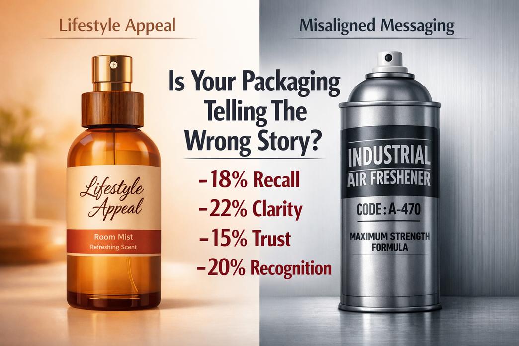
당신의 룸 스프레이 포장 세련되어 보일 수도, 하지만 여전히 구매자가 기대하는 분위기가 그리워요. 산업용 캔부터 라이프스타일 스프레이까지, 포장이 말하는 방식은 조용히 브랜드 신뢰도와 매출을 높이거나 해칠 수 있습니다..
잘못 정렬된 메시징: 산업용 캔이 너무 임상적으로 보일 때
언제 룸 스프레이 포장 차갑고 임상적인 느낌, 그것은 변화한다 브랜드 인지도 초 안에. 아늑한 곳을 쇼핑하는 구매자 룸스프레이 실험실에 있는 것처럼 보이는 것을 원하지 않습니다.
- 코어 연결 끊김이 자주 나타납니다.:
- 무시할 수 없는 가혹한 금속 마감 제품 미학
- 압도적인 기술 글꼴 시각적 단서
- 스토리텔링 제로 향기 체험
표면 아래, 문제는 일반적으로 더 깊은 곳에 있습니다.:
- 시각적 톤
- 색상 팔레트
- 흰색과 회색의 과도한 사용을 줄입니다. 소비자 호소
- 따뜻함이 부족하면 정서적 매력이 약해집니다.
- 타이포그래피
- 산업용 글꼴은 라이프스타일 중심 글꼴과 충돌합니다. 포장 디자인
- 색상 팔레트
- 감각 정렬
- 라벤더가 부드러우면, 그만큼 룸 스프레이 포장 잔잔하게 울려퍼져야 해.
- 감귤이 활력이 있다면, 스프레이 포장에는 펀치가 필요합니다.
- 시장 기대 변화
- 민텔의 2025 home fragrance update noted that buyers increasingly link scent products with mood enhancement and décor styling, not just function.
“Home fragrance buyers now expect packaging to reflect lifestyle identity as much as scent performance.” — Mintel, 2025
다음과 같은 브랜드 판쉰 adjust 룸 스프레이 포장 by balancing durability with warmth, so industrial strength doesn’t kill emotional connection.
Overcomplicated Artwork: Losing Clarity on Your Metal Pails
Crowded packaging artwork can tank brand recognition 빠른. If buyers can’t read it in three seconds, 게임 끝났어.
Common red flags in spray packaging:
- Too many icons competing with 라벨 디자인
- 약한 정보 계층
- Decorative layers causing visual clutter
Here’s how complexity impacts clarity in industrial-style 모노 탑 캔 used for 룸 스프레이 포장:
| 요인 | Simple Design | Overloaded Design | Impact on Sales |
|---|---|---|---|
| Font Count | 1-2 | 4+ | -18% recall |
| Color Layers | 2-3 | 6+ | -22% 명쾌함 |
| Message Blocks | 3 key points | 8+ fragments | -15% 신뢰하다 |
| Logo Visibility | High contrast | 혼합된 배경 | -20% 인식 |
분명한 제품 차별화 승리. 날카로운 계층 구조. 굵은 로고. 깨끗한 향기 설명.
실제 재설정은 다음과 같습니다.:
- 필수 요소로 다시 돌아가세요.
- 구매자 우선순위별 순위 세부정보.
- 재구축 룸 스프레이 포장 선명도 주변, 장식이 아닌.
판쉰 산업용 금속 표면을 깨끗하게 유지하면서 향기의 정체성을 숨쉬게 합니다., 그래서 포장 디자인 제품에 대해 큰 소리를 지르는 대신 제품을 지지합니다..
무시된 청중: 화학 및 식품 등급 구매자 모두에게 어필하지 못함
이중 시장은 복잡하다 룸 스프레이 포장 결정. 산업 바이어가 사양을 확인합니다.. 소매 구매자는 분위기를 확인합니다. 둘 중 하나라도 놓쳐, 그리고 성장 정체.
주요 대상 계층에는 다음이 포함됩니다.:
- 기술 구매자
- 집중하다 규제 준수
- 요구 증명 제품 안전
- 조사하다 포장 재료
- 라이프스타일 구매자
- 판사 소비자 신뢰 마무리와 인쇄를 통해
- 향상된 스프레이 포장 미학을 기대하세요
- 외관과 향기 품질 연관
- 대리점
- 필요 이중 목적 포장 명쾌함
- 가치 있는 시장 세분화
양쪽의 균형을 맞추는 것이 가장 효과적인 경우는 다음과 같습니다.:
- 산업구조가 견고하게 유지됨.
- 시각적 스토리텔링은 인간성을 유지합니다.
- 안전 메시지는 눈에 띄지만 부담스럽지는 않습니다..
똑똑한 룸 스프레이 포장 규정 준수와 매력이 조화를 이루고 있습니다.. 캔은 화학 물질을 안전하게 담습니다.. 외관은 여전히 선반 준비가 된 느낌입니다..
그 균형은 어디에 판쉰 눈에 띕니다. 화학적 표준과 라이프스타일 기대치를 모두 존중하는 사려 깊은 포장 디자인으로 포장된 엔지니어링 등급 내구성.
포장 대. 향수: 구매를 유도하는 요소?
쇼핑객이 선반을 살펴보거나 온라인으로 스크롤할 때, 룸 스프레이 포장 향기가 나기 전에 말을 하는 경우가 많다. 외관, 병 느낌, 물보라 소리도 분위기를 빠르게 만들어주네요. 아직, 첫 구매가 습관이 될지는 안에 들어있는 향수가 결정한다. 룸스프레이의 세계로, 포장과 향수는 끊임없이 관심을 끌기 위해 경쟁합니다..

포장
에서 룸 스프레이 포장 게임, 시각적 단서가 강하고 빠르게 전달됩니다..
- 시각적 & 신체적 매력
- 미학
- 색상 균형
- 깨끗한 라벨 디자인
- 모양
- 슬림 실린더
- 그립감을 위한 둥근 모서리
- 재료
- 젖빛 유리
- 무광택 코팅 알루미늄 에어로졸 캔
- 미학
- 성능 & 실용적인 사항
- 기능
- 미세 미스트 분무기
- 누출 방지 캡
- 내구성
- 긁힘 방지
- 낙하 테스트 완료 엔진 오일 캔 스타일의 견고함.
- 기능
- 시장 영향
- 소매점에서의 선반 영향
- 전자상거래에서의 스크롤 정지 효과
- 스마트룸 스프레이병 디자인과 연계한 브랜드 메모리
FANXUN은 룸 스프레이 포장 개발에 중점을 두고 있습니다., 균형을 잡는 대담한 미학 고체로 내구성. 스프레이 포장에 대한 그들의 접근 방식은 눈에 띄게 혼합되어 있습니다. 모양 선택과 실용성 기능, 룸 스프레이 패키지를 용기라기보다는 라이프스타일 제품처럼 느껴지게 만듭니다.. 혼잡한 룸스프레이 시장에서, 스마트 룸 향수 포장은 누군가가 제품 냄새를 맡기도 전에 거래를 성사시킬 수 있습니다..
향수
아직, 향기로 인해 고객이 다시 방문하게 됩니다.
- 핵심 향기 구성
- 향기 프로필
- 신선한 감귤
- 따뜻한 우디 블렌드
- 향수 노트
- 탑 스파크
- 기본 깊이
- 향기 가족
- 꽃무늬
- 동양인
- 향기 프로필
- 성능 지표
- 장수
- 하루 종일 신선함
- 강함
- 가벼운 미스트
- 대담한 버스트
- 전반적인 방향 균형
- 장수
- 정서적 연결
- 기억 유발 후각 경험
- 기분 설정 방향 확산
- 시그니처 향기 인식
FANXUN은 세련된 향수 개발과 뛰어난 룸 스프레이 포장을 결합합니다., 보장 향기 프로필 룸스프레이 포장의 약속과 일치합니다.. 강한 장수 그리고 균형 잡힌 강함 일회성 구매를 반복 수요로 전환. 결국, 룸스프레이 포장이 판매를 촉발할 수 있다, 하지만 향수는 관계를 봉인해 주죠.
왜 80% 포장으로 구매자 판단
쇼핑객이 선반을 살펴보거나 온라인으로 스크롤할 때, 결정은 빠르게 이루어진다. 세계에서는 룸 스프레이 포장, 그 순간적인 판단은 판매를 성사시키거나 깨뜨릴 수 있습니다. 스프레이 포장 디자인부터 향수 포장 디테일까지, 작은 시각적 단서가 큰 소리로 말함. 스마트 브랜드는 룸 스프레이 포장을 조용한 영업사원처럼 항상 근무합니다..
첫인상: 에어로졸 캔 미학의 영향
실내 스프레이 포장, 시각적 매력은 구조에서 시작하여 세부 사항으로 이어집니다..
- 모양을 만들 수 있다
- 슬림한 실린더는 현대적인 느낌을 주며 잡기 쉽습니다..
- 더 넓은 몸체는 힘과 오래 지속되는 스프레이를 제안합니다..
- 맞춤형 실루엣으로 스프레이 병 포장을 모방품과 즉시 분리합니다..
- 컬러 팔레트
- 부드러운 중성색은 차분함을 암시합니다., 스파 스타일의 향기.
- 대담한 톤은 붐비는 통로에서 활력을 주고 시선을 사로잡습니다..
- 그라데이션 블렌드는 과하지 않으면서 향수 포장에 깊이를 더해줍니다..
- 그래픽 디자인 & 타이포그래피
- 깨끗한 그래픽 디자인 날카로운 것과 짝을 이루다 타이포그래피 가독성 향상.
- 대형 향기 이름은 빠른 결정을 안내합니다.
- 균형 잡힌 간격 향상 전체적인 시각적 매력.
- 마치다 & 뚜껑 디자인
- 매트 마치다 부드럽고 절제된 느낌.
- 광택 코팅은 빛을 반사하여 선반에 돋보입니다..
- 꽉, 모양이 좋은 뚜껑 디자인 스프레이 포장 생산의 신호 관리.
“패키징은 여전히 가정용 향수 카테고리에서 가장 중요한 시험 요인 중 하나입니다.,"라고 Mintel은 말합니다. 2025 글로벌 포장 동향 보고서, 시각적 디자인이 첫 구매에 직접적인 영향을 미친다는 점을 강조.
FANXUN과 같은 브랜드는 룸 스프레이 포장의 모든 층을 개선하여 모양이 향기 약속과 일치하도록 합니다..
인지된 품질: 금속통이 신호값을 완성하는 방법
구매자는 종종 가격보다 무게를 테스트합니다.. 그 미묘한 리프트는 인식을 빠르게 형성합니다..
- 금속 마감 & 조직
닦은 금속 마감 시원함을 준다, 세련된 터치. 미묘한 추가 조직, 제품이 정교하게 만들어진 느낌이에요, 대량생산이 아닌.
- 내구성 & 무게
더 무거운 통이 좋습니다 내구성. 고체 무게 내부의 포장 스프레이 시스템이 보호되고 있음을 고객에게 확신시킵니다..
- 룸 스프레이 포장의 수준을 높이는 프리미엄 신호:
- 두꺼운 벽
- 균일한 가장자리
- 깨끗한 솔기
래커 코팅 & 엠보싱
매끄러운 래커 코팅 긁힘으로부터 그래픽을 보호합니다.. 빛 엠보싱 느낄 수 있는 깊이를 더해줍니다. 그 촉각의 순간이 진실을 만들어낸다 프리미엄 느낌, 특히 고급 스프레이 병 포장 라인에서.
룸스프레이 포장이 튼튼하다고 느껴질 때, 쇼핑객은 더 높은 가격을 지불하는 것을 더 편안하게 생각합니다.. 단순한 심리학이다.
브랜드 신뢰성: 신뢰를 구축하는 액세서리 및 라벨
신뢰는 대부분의 사람들이 의식적으로 알아채지 못하면서도 항상 판단하는 세부사항에서 자라납니다..
- 라벨 재질
- 방수 필름은 습한 욕실에서 벗겨짐을 방지합니다..
- 두꺼운 재고는 고품질 룸 스프레이 포장에 대한 투자를 나타냅니다..
- 인쇄 품질 & 정보 명확성
- 상쾌한 인쇄 품질 향기 설명을 읽을 수 있도록 유지.
- 명확한 성분과 안전 사항이 개선되었습니다. 정보 명확성.
- 사용법
- 보관 조언
- 연락처
- 로고 배치 & 명령어 설계
- 가운데 맞춤 로고 배치 회상을 강화한다.
- 깨끗한 지시 설계 향수 포장 레이아웃의 혼란 방지.
- 보안 씰 & 바코드 가독성
- 단단한 보안 씰 변조를 방지.
- 날카로운 바코드 가독성 원활한 소매점 스캔 보장.
이 모든 조건을 충족하는 룸 스프레이 포장은 장기적인 신뢰를 구축합니다.. FANXUN은 액세서리를 정렬합니다, 스프레이 포장 구성 요소, 라벨링 표준을 통해 브랜드는 처음부터 신뢰할 수 있는 것처럼 보이고 그 상태를 유지합니다..
자주 묻는 질문
생생한 색상이 룸 스프레이 포장 판매에 어떤 영향을 미칩니 까??
색깔은 향기보다 먼저 말한다.
- 밝은 톤은 혼잡한 소매점 및 산업용 선반에서 시선을 사로잡습니다..
- 명확한 대비로 OEM 대량 구매자를 위한 향수 라인 분리.
- 일관된 색상 코딩으로 창고 선택 및 반복 주문이 단순화됩니다..
빠르게 변화하는 도매 환경에서, 시각적 명확성은 한 눈에 신뢰를 구축합니다..
화학 및 산업용 룸 스프레이 포장에 금속 통을 사용하는 이유는 무엇입니까??
금속통은 강도와 실용성의 균형을 유지합니다..
- 용매 및 압력 변화에 강함.
- 수출 팔레트용으로 쌓을 수 있음.
- 식품 등급 또는 화학 제제에 적합.
대규모 OEM 계약을 취급하는 유통업체용, 내구성으로 누출 위험과 배송 배상 청구가 줄어들어 비용과 평판이 동시에 절약됩니다..
에어로졸 캔에 고품질 라벨이 중요한 이유?
라벨은 장식이 아니다; 그것은 약속이다.
- 습기 방지 코팅으로 습기가 많은 보관 시 벗겨짐을 방지합니다..
- 선명한 타이포그래피로 규정 준수 가시성 향상.
- 장거리 운송에도 견딜 수 있는 강력한 접착제.
인쇄 품질이 좋지 않으면 모형 미리보기 중에 시스템 스타일 오류가 노출될 수도 있습니다., 깔끔한 실행 등 브랜드 신뢰도를 보호합니다..
투명한 창문이 구매자의 신뢰를 높이는 방법?
작은 투명 패널은 즉시 인식을 바꿀 수 있습니다..
구매자는 참조:
- 액체색소
- 채우기 수준
- 제품 진품
환대 공급망 및 개인 상표 수출, 가시성이 솔직하게 느껴지고 대량 구매 결정 시 망설임이 줄어듭니다..
룸 스프레이 포장의 인지된 품질을 향상시키는 마감재?
마감은 분위기와 시장 위치를 결정합니다.
| 마감 유형 | 시각 효과 | 구매자 인상 |
|---|---|---|
| 매트 | 부드러운, 현대의 | 프리미엄 라이프스타일 |
| 광택 | 빛을 끄는 | 높은 선반 충격 |
| 메탈릭 | 반사강도 | 산업적 내구성 |
오른쪽 표면은 간단한 에어로졸 캔을 사람들이 선택하고 다시 주문하고 싶은 제품으로 바꿔줍니다..
참고자료
- 맥킨지 & 회사: 매장 내 구매 결정 및 시각적 단서 – mckinsey.com
- 오늘날의 심리학: 색상 심리학과 소비자 행동 – 심리학투데이.com
- 미국 산업 디자이너 협회 (IDSA): 인체공학적 포장의 원리 – industrydesign.org
- UL 솔루션: 내화학성 라벨링 표준 – ul.com
- 닐슨IQ: 소매업에서 투명성과 제품 가시성의 역할 – nielseniq.com
- 스미더스: 프리미엄 패키징의 질감적 요소와 촉각적 경험 – smithers.com
- 포브스: 명품의 시각적 커뮤니케이션과 브랜드 아이덴티티 – forbes.com
- 쇼피파이: 전자상거래를 위한 미니멀리스트 포장 디자인 트렌드 – shopify.com
- 민텔: 2025 글로벌 포장 트렌드 및 소비자 인사이트 – mintel.com
- 광고저널: 레트로 브랜딩과 향수의 심리학 – Journalofadvertising.org
- 산업안전보건청 (OSHA): 위험 통신 및 안전 표준 – osha.gov
- 숙박 매거진: 호텔 산업의 포장 동향 – lodgingmagazine.com
- EPA: Sustainable Packaging and Metal Recyclability Standards – epa.gov
- Skift: Luxury Home Fragrance and Lifestyle Market Analysis – skift.com
- 정치가: Consumer Trust and Packaging Quality Metrics – statista.com