 日本語
日本語 English
 العربية
 Bosanski jezik
 Čeština
 Dansk
Dansk Nederlands
 Wikang Filipino
 Suomi
Suomi Français
 Deutsch
 Magyar
 Íslenska
 Bahasa Indonesia
 Italiano
 한국어
한국어 Bahasa Melayu
 Polski
 Português
 Русский
 Cрпски језик
 Español
 ภาษาไทย
 Türkçe
 Tiếng Việt
ルーム スプレーのパッケージは、単なる金属缶や光沢のあるペールではありません。これは、製品が通路を横切る最初の瞬間です。. 一瞬で, 購入者はサイズアップする: 安いかプレミアムか, 安全か危険か, 価値があるかハードパスか. 混雑した化学製品およびホームフレグランス市場, パッケージングが購入時のトリガーを引く.
マッキンゼーの報告によると、 70% of purchasing decisions happen in-store, shaped by visual cues.
That’s the make‑or‑break moment. Your valve feel, color pop, label clarity—each detail whispers trust… or doubt. 正しく理解しましょう, and procurement teams lean in. Miss the mark, and your product collects dust like last year’s leftovers.
Quick Insights on Room Spray Packaging
➔ Leverage vibrant hues and contrasting color schemes for instant shelf appeal.
➔ Design ergonomic, 金属ペールと互換性のある積み重ね可能なシルエットで多用途性を実現.
➔ 透明な窓と高品質の窓を使用する, 信頼を築く耐薬品性ラベル.
➔ 質感要素(マットワニスやソフトタッチコーティング)を組み込んで高級感を演出.
➔ 仕上げを最適化する (光沢, マット, メタリックな) 視認性とブランドストーリーを高める大胆なタイポグラフィー.
7 目を引くルームスプレーのパッケージの秘密
ルームスプレーのパッケージは単なる容器ではありません; 香りが空気に漂う前に、人々がどのように感じるかを形作ります. スプレーボトル包装からルームフレグランス包装システムまで, スマートなデザインが棚の集客とブランドの信頼を高めます. ルームスプレーのパッケージがどのようにして急速に注目を集めるのかを詳しく見てみましょう.

秘密 1: エアゾール缶に鮮やかな色を活用
ルームスプレーのパッケージをデザインするとき, 色が瞬時の反応を促す. 強い 鮮やかな色 の上 エアゾール缶 リフト 視覚的な魅力 and align with your brand palette. Smart color psychology connects scent mood with buyer emotion.
Key performance comparison in spray bottle packaging color strategy:
| Color Tone | Consumer Recall Rate (%) | Purchase Intent (%) | 棚の可視性スコア (1-10) | Trend Growth 2025 (%) |
|---|---|---|---|---|
| Citrus Orange | 78 | 64 | 9 | 12 |
| フォレストグリーン | 71 | 59 | 8 | 9 |
| Ocean Blue | 74 | 61 | 8.5 | 11 |
| Matte Black | 69 | 57 | 7.5 | 8 |
| Lavender Purple | 76 | 63 | 8.8 | 10 |
For room spray packaging:
- High contrast boosts recall.
- 季節限定 color trends refresh product lines.
- 一貫した色調でルームフレグランスのパッケージのアイデンティティを強化.
FANXUN などのブランドは、カラー レイヤーを微調整して、パッケージング スプレー製品が小売店の照明の下でも派手に見えないようにしています。.
秘密 2: 金属ペールを念頭に置いて、ユニークなボトルの形状を作成します。
賢い ユニークなボトル形状 ルームスプレー包装の雰囲気と物流の両方を改善します.
- を定義します コンテナのシルエット それは目立つ.
- グリップの快適さを追求した人間工学に基づいたデザインをテストする.
- スタッキングの適合性をチェックする 金属製のバケツ そして外箱.
このプロセスの下で:
- デザインレイヤー
- 特徴的な曲線 特徴的なフォルム
- バランスのとれた高さと幅の比率
- エンジニアリング層
- 肉厚制御
- 安定したベース形状
- 供給層
- 二次包装に収まる
- 工業用充填ラインとの調整
このパッケージ構造により、スプレーパッケージは洗練されており、しかも倉庫に適しています。.
秘密 3: 高品質のラベルと工業グレードのアクセサリを組み込む
ルームスプレーのパッケージは手触りとディテールで表現されています.
• 使用 高品質のラベル 耐薬品性ラベル素材を使用.
• アップグレード カスタマイズ シャープな香りのノートに.
• 正確な選択 閉鎖機構 そして強い ディスペンサーの品質.
舞台裏:
- 材料
- 耐油フィルム
- 防水接着剤
- ハードウェア
- 産業 アクセサリー
- バルブスプリングの安定性
- パフォーマンス
- 長期 耐久性
- 安定したスプレーミスト
FANXUN は、湿気の多いバスルームでも使用できるスプレー ボトルのパッケージに焦点を当てています。, ホテルの部屋, 工場の現場も同様に.
秘密 4: 透明な窓を使用して内部の香りを明らかにします
ルームスプレーパッケージの透明パネルは瞬時に信頼を生み出します.
✦ 透明な窓 増加 製品の可視性.
✦ 微妙な 香りを明らかにする 液体の色を表現します.
✦ 透明性の構築 感覚に訴える スプレーする前に.
多層的なアプローチ:
- 視覚的な信頼
- 正確な充填レベル表示
- きれいな内部の透明度
- 感情のトリガー
- 色は香りの雰囲気を暗示します
- 信頼性を強化する
- 小売業の利点
- 棚上で比較しやすくなりました
- ブーストされたインパルスピックアップ
を示すルームフレグランスのパッケージ, 隠さない, 多くの場合、変換が速くなります.
秘密 5: テクスチャ要素を追加して高級感を演出
タッチが重要な場合、ルーム スプレーのパッケージの感触が変わります.
ソフトタッチのコーティングによりグリップ力が向上.
微妙 エンボス加工 または デボス加工 深みを与える.
滑らかな マット仕上げ 小さなものと組み合わせた 光沢のあるアクセント コントラストを鮮明にする.
開発の流れ:
- サーフェスベースを選択してください.
- 適用する テクスチャ要素 ブランドトーンに合わせた.
- 実際の手の触感をテストする.
プレミアムルームスプレーのパッケージには派手な追加物は必要ありません. 制御された プレミアム感 多くの場合、忙しいグラフィックスよりも高いロイヤルティを獲得します.
秘密 6: 印象的なタイポグラフィーでブランドストーリーを強調
ルームスプレーのパッケージの雰囲気を伝えるタイポグラフィ.
- 印象的なタイポグラフィー アイデンティティを形作る.
- 頭いい フォントの選択 ブースト 可読性.
- クリア 書体の階層 目を導く.
このように構造化します:
- 見出しレイヤー
- 大胆な香りの名前
- 自信のある体重
- 詳細レイヤー
- 材料
- ご利用案内
- ナラティブレイヤー
- 短い ブランドストーリー
- 感情的なフック
強力なビジュアルコミュニケーションが、シンプルなスプレーパッケージを記憶に残るルームフレグランスのパッケージに変える.
秘密 7: 戦略的な梱包仕上げにより棚への影響を最適化
棚の照明がルームスプレーのパッケージのすべてを変える.
2 主要なフィニッシュパス:
- 輝きを放つ高光沢.
- ソフトマットでモダンな落ち着き.
デシジョンツリー:
- フィニッシュチョイス
- 光沢 → 光反射率が高い
- マット → 柔らかな上品さ
- メタリック → 大胆な高級感
- ビジュアル階層
- ハイライトロゴゾーン
- 曖昧な二次情報
- 際立ったデザイン
- キャップとボディのコントラスト
- と揃える 製造業 目標.
頭いい 仕上げのテクニック 本物のドライブ 消費者の注目. ファンシュン 各ルームスプレー包装ラインが棚に強い衝撃を与えても、やりすぎ感を感じさせないように包装仕上げを調整します。.
ミニマリストの予算でルームスプレーのパッケージを作成
頭いい ルームスプレーのパッケージ 財布を使い果たす必要はありません. 香りがしっかりしてきたら, 本当の勝負は部屋をどうするかにかかっています, スプレー, とパッケージングは連携して作業します. すっきりとした見た目, スマートな素材選び, 創造的な小さな調整を行うことで、恐ろしい請求書を使わずにルーム スプレーのパッケージを高級感のあるものにすることができます。.
設計の簡素化: 金属ペールのきれいなライン
整形するとき ルームスプレーのパッケージ その周り 金属製のバケツ, 明快さが勝つ.
- コアビジュアルディレクション
- ミニマリストの美学
- ニュートラルなベースカラー
- 限られたタイポグラフィー
- 呼吸室のための広いスペース
- きれいなライン
- 直線の境界線
- シンプルなロゴ配置
- バランスの取れたアライメント
- ミニマリストの美学
- 表面処理
- 洗練された仕上がり
- マット塗装でソフトな手触り
- 控えめな輝きのための軽い光沢
- インク適用範囲を減らして印刷コストを削減
- 洗練された仕上がり
- ブランドの焦点
- 強い ブランドアイデンティティ 1 つの太字のマークを通して
- 制御された 視覚的な魅力 スケールを使用して, 乱雑ではない
ルームスプレーのパッケージの優れたパッケージデザインは、装飾ではなく、抑制を重視しています。. 鋭く保ちます. 落ち着いてください.
コスト効率の高い材料: 品質を犠牲にすることなく手頃な価格のエアゾール缶
予算に優しい エアゾール缶 ルームスプレーのパッケージに入っていても合法的に見えます.
- 簡素化するには標準化されたサイズを選択してください 材料調達.
- 内部コーティングが香料配合の安全規則を満たしていることを確認する.
- バッチテストをリクエストする 品質保証 そして長期的な 耐久性.
- 機能を優先する
- スムーズなスプレーバルブ
- 日常使用でも安心の密閉性
マッキンゼーの最近の小売調査では、消費者が「価格に敏感でも知覚品質を維持できる、価値を重視した製品」を求めて取引を続けていることが指摘されています。
「買い物客は、包装だけのために割増料金を支払うことを嫌がるようになっています」, しかし、それでも耐久性と責任ある材料の選択が期待されます。」 — マッキンゼー グローバル パッケージング レポート, 2024
その洞察はルームスプレーのパッケージにぴったり当てはまります. 知覚される品質に焦点を当てる, 点滅しない, スプレーのパッケージはすぐに信頼を獲得します.
DIY ラベルのトリック: 価値観を高めるクリエイティブなアクセサリー
小さなアップグレードで、基本構造を変更せずにルームスプレーのパッケージを変えることができます.
- ラベルファンデーション
- 強い ラベルデザイン
- クリアな香りの名前
- Short mood tagline
- Layered DIY labels
- Textured paper
- Transparent overlays
- 強い ラベルデザイン
- Visual lift
- Subtle foil stamp for visual enhancement
- Custom caps as creative accessories
- Color-coded tops for scent families
- Brand storytelling
- Tiny icons as branding elements
- Handwritten-style batch numbers for カスタマイズ.
These tweaks quietly raise perceived value. Room spray packaging, スプレー包装, even simple room packaging can feel boutique with the right touch. Keep it clever, keep it lean, and let the scent do the talking.
5 Emotional Triggers Every Spray Package Must Hit
Great ルームスプレーのパッケージ is not just a container; it’s a vibe. From metal pails to aerosol cans, smart spray packaging shapes how people feel before they even press the nozzle. Let’s break down how to hit those triggers.

Nostalgia: Vintage-Inspired Labels on Metal Pails
When customers pick up ルームスプレーのパッケージ styled with vintage labels on 金属製のバケツ, emotion kicks in fast. The pull of retro design そして classic aesthetic feels safe, おなじみ, and oddly comforting.
For heritage-driven spray packaging projects, ファンシュン often organizes design thinking like this:
- ビジュアルアイデンティティ
- Typography
- Serif fonts with 1920s curves
- Handwritten scripts for craft appeal
- Color Direction
- Muted greens
- Dusty blues
- Warm cream tones
- Typography
- Material Expression
- Embossed tin surfaces
- Matte varnish for a timeless appeal
- Brand Story
- Short origin story printed near the base
- Small badge icons reinforcing heritage branding.
ミンテル社によると 2025 Global Packaging Trends report:
“Consumers increasingly associate retro-inspired packaging with authenticity and higher perceived product value, especially in home fragrance categories.”
That insight explains why ルームスプレーのパッケージ with a nostalgic tone often commands better shelf attention.
Excitement: Bold Graphics for Your OEM Aerosol Collection
Energy sells. のために OEM lines, bold graphics 横切って エアゾール缶 create instant impact in any room spray package display.
FANXUN structures high-impact spray packaging development in layered phases:
- Concept Spark
- Trend scan
- Street art influence
- Pop culture references
- Target profile mapping
- Trend scan
- Design Execution
- 適用する 鮮やかな色
- 統合する dynamic designs with angled typography
- テスト eye-catching visuals under retail lighting
- Shelf Simulation
- Compare contrast ratios
- Adjust saturation for modern appeal
管理された小売テストからの主要なパフォーマンスのスナップショット:
| デザインタイプ | 色のコントラスト % | 棚停止率 % | Purchase Intent % |
|---|---|---|---|
| ミニマルマット | 35 | 42 | 38 |
| レトロなパターン | 48 | 57 | 51 |
| ネオングラフィック | 72 | 76 | 68 |
| 高光沢アーバン | 81 | 83 | 74 |
興奮は偶然ではない. 内部でスマートに設計されています ルームスプレーのパッケージ 決断.
信頼: 工業市場および特定の食品市場向けの明確な成分表示
信頼は静かに、しかし力強く築かれます ルームスプレーのパッケージ, 特に産業顧客や規制されたスペース向け.
FANXUN は通常、このようなコンプライアンス重視のスプレー包装を組織しています。:
- 透明レイヤー
- 満杯 成分表 読みやすいフォントサイズで
- わかりやすい説明
- 安全層
- 安全情報アイコンをクリアする
- に合わせた危険分類 工業規格
- コンプライアンス層
- 認証マーク
- に関する注意事項 規制遵守
- ラベルステートメント 食品グレードの包装 必要に応じて.
バーコード補強の近くに短い保証線を追加します。 製品の完全性, そして買い手はリラックスする. きれいなラベルは叫ばない. 安心させます.
喜び: Playful Icons and Color Pops on Your Packaging Accessories
Not every room spray package has to be serious. Some should smile back.
で accessory lines—caps, gift boxes, refills—FANXUN uses:
- playful icons
- Bright color pops
- 小さい whimsical elements near the spray trigger
Development flow often looks like this:
- Define emotional tone: cute, 大胆な, or artsy
- Select two primary vibrant accents
- Add one unexpected fun design detail
- Balance with neutral base to avoid overload
その組み合わせがスタンダードになる ルームスプレーのパッケージ 顧客がギフトとして好む表情豊かなパッケージに仕上げる.
快適: 家庭とおもてなしを伝えるソフトタッチ仕上げ
快適さは手に宿る. ソフトタッチ仕上げがすべてを変える.
ホスピタリティ業界向け ルームスプレーのパッケージ, FANXUN は段階的に触覚戦略を洗練させます:
- 表面工学
- マイクロテクスチャーのマットコーティングを適用
- 最適な摩擦レベルをテストする 触覚体験
- 視覚的な暖かさ
- アースカラーと調和 家の装飾
- 微妙なグラデーションがサポート 招待状のパッケージ 感じる
- プレミアムキューの統合
- ソフトメタリックのロゴスタンプ
- ミニマリストのレイアウトが特徴を強化 プレミアム感
- 宿泊客のニーズに合わせたポジショニング.
結果? 微妙な 贅沢なタッチ ゲストに安心感を与える. スプレーのパッケージは単なる保護以上のものになります; それは雰囲気の一部になる.
あなたのパッケージは間違った物語を伝えていますか?
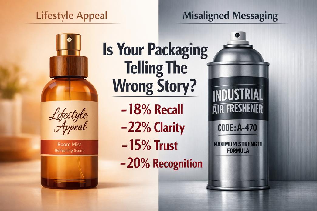
あなたの ルームスプレーのパッケージ 洗練されて見えるかもしれない, それでも、購入者が期待する雰囲気を見逃しています. 業務用缶から生活スプレーまで, パッケージが語る方法は、ブランドの信頼と売上を密かに高めたり、傷つけたりする可能性があります.
不整合なメッセージング: 工業用缶が臨床的すぎる場合
いつ ルームスプレーのパッケージ 冷たくて臨床的だと感じる, それは変わる ブランド認知 数秒で. 居心地の良い空間を求めて買い物をするバイヤー ルームスプレー 研究室にあるようなものは望まない.
- コアの切断は頻繁に発生します:
- 無視する過酷なメタリック仕上げ 製品の美学
- 圧倒的なテクニカルフォント 視覚的な手がかり
- ストーリーテリングはゼロ 香り体験
表面の下で, 問題は通常、より深いところにあります:
- ビジュアルトーン
- カラーパレット
- 白とグレーの使いすぎが減る 消費者の魅力
- 暖かさの欠如は感情的な引力を弱める
- Typography
- インダストリアルフォントとライフスタイル重視のフォントが衝突する パッケージデザイン
- カラーパレット
- 感覚の調整
- ラベンダーが柔らかければ, the ルームスプレーのパッケージ 静かに響くはずだ.
- 柑橘類が元気なら, スプレーのパッケージにはパンチが必要です.
- 市場の期待の変化
- ミンテルの 2025 ホームフレグランスの最新情報では、購入者が香り製品を気分の向上やインテリアのスタイリングと結びつけることが増えていると指摘しました。, 機能だけではなく.
「ホームフレグランスの購入者は現在、香りの性能だけでなく、パッケージがライフスタイルのアイデンティティを反映することを期待しています。」 — ミンテル, 2025
のようなブランド ファンシュン 調整する ルームスプレーのパッケージ 耐久性と暖かさを両立させることで, 産業の強さが感情的なつながりを失わないように.
複雑すぎるアートワーク: 金属ペールの透明度が失われる
混雑した パッケージアートワーク 缶タンク ブランド認知度 速い. 購入者が 3 秒以内に読めない場合, ゲームオーバーです.
スプレー包装における一般的な危険信号:
- 競合するアイコンが多すぎます ラベルデザイン
- 弱い 情報階層
- 装飾層の原因 視覚的な混乱
複雑さがインダストリアルスタイルの明瞭さにどのように影響するか 単調な缶 に使用される ルームスプレーのパッケージ:
| 要素 | シンプルなデザイン | オーバーロードされた設計 | 売上への影響 |
|---|---|---|---|
| フォント数 | 1–2 | 4+ | -18% 想起 |
| カラーレイヤー | 2–3 | 6+ | -22% 明瞭さ |
| メッセージブロック | 3 重要なポイント | 8+ 断片 | -15% 信頼 |
| ロゴの可視性 | ハイコントラスト | ブレンドされた背景 | -20% 認識 |
クリア 製品の差別化 勝ちます. 明確な階層構造. 大胆なロゴ. クリーンな香りのコールアウト.
実際のリセットは次のようになります:
- 必要なものをすべてそぎ落として.
- 購入者の優先順位によるランクの詳細.
- を再構築します ルームスプレーのパッケージ 明瞭さのあたり, 装飾ではありません.
ファンシュン 工業用金属の表面を清潔に保ちながら、香りのアイデンティティを呼吸させます。, それで、 パッケージデザイン 製品について大声で叫ぶのではなくサポートする.
無視された聴衆: 化学品と食品グレードのバイヤーの両方にアピールできない
二重市場は複雑化する ルームスプレーのパッケージ 決断. 産業用バイヤーは仕様を確認する. 小売バイヤーは雰囲気をチェックする. どちらかが欠けている, そして成長が停滞する.
主な視聴者層には以下が含まれます:
- テクニカルバイヤー
- 焦点を当てる 規制遵守
- の要求証明 製品の安全性
- 診る 梱包材
- ライフスタイルバイヤー
- 裁判官 消費者の信頼 仕上げから印刷まで
- スプレー包装の美しさの向上を期待する
- 見た目と香りの質を関連づける
- 販売代理店
- 必要 二重目的の包装 明瞭さ
- 価値を容易に市場セグメンテーション
両側のバランスが最も良く機能するのは、次の場合です。:
- 産業構造は堅調に推移.
- 視覚的なストーリーテリングは人間味を保ちます.
- Safety messaging stays visible but not overwhelming.
頭いい ルームスプレーのパッケージ blends compliance and charm. The can holds chemicals safely. The exterior still feels shelf-ready.
That balance is where ファンシュン stands out—engineering-grade durability wrapped in thoughtful packaging design that respects both chemical standards and lifestyle expectations.
Packaging Vs. 香水: Which Drives Purchase?
When shoppers scan shelves or scroll online, ルームスプレーのパッケージ often speaks before the scent does. The outer look, the bottle feel, even the spray sound set the mood fast. まだ, the perfume inside decides if that first buy turns into a habit. In the world of room spray, packaging and fragrance constantly compete for attention.

包装
で ルームスプレーのパッケージ game, visual cues hit hard and fast.
- ビジュアル & Physical Appeal
- 美学
- Color balance
- クリーン ラベルデザイン
- 形
- Slim cylinders
- Rounded edges for grip
- 材料
- Frosted glass
- Matte-coated アルミエアゾール缶
- 美学
- パフォーマンス & Practicality
- 機能
- Fine mist sprayers
- Leak-proof caps
- 耐久性
- 耐傷性
- Drop-tested エンジンオイル缶 style robustness.
- 機能
- Market Influence
- Shelf impact in retail
- Scroll-stopping effect in e-commerce
- Brand memory linked to smart room spray bottle design
FANXUN focuses heavily on room spray packaging development, balancing bold 美学 with solid 耐久性. Their approach to spray packaging blends striking 形 choices and practical 機能, making room spray packaging feel less like a container and more like a lifestyle piece. In a crowded room spray market, smart room fragrance packaging can close the deal before anyone even smells the product.
香水
まだ, scent keeps customers coming back.
- Core Scent Construction
- scent profile
- Fresh citrus
- Warm woody blends
- fragrance notes
- Top spark
- Base depth
- scent family
- 花柄
- Oriental
- scent profile
- パフォーマンス指標
- 長寿
- All-day freshness
- intensity
- Light mist
- Bold burst
- 全体 香り バランス
- 長寿
- Emotional Connection
- Memory-triggering olfactory experience
- Mood-setting 香り 拡散
- Signature scent recognition
FANXUN は洗練された香水の開発と傑出したルームスプレーのパッケージを組み合わせています, を確保する scent profile ルームスプレーのパッケージに記載されている約束と一致します. 強い 長寿 そしてバランスの取れた intensity 1 回限りの購入をリピート需要に変える. 最後に, ルームスプレーのパッケージが販売のきっかけになる可能性がある, でも香水は関係を封印する.
なぜ 80% パッケージで判断する購入者の割合
When shoppers scan shelves or scroll online, 意思決定は迅速に行われます. の世界で ルームスプレーのパッケージ, 瞬時の判断が販売の成否を左右します. スプレーのパッケージデザインからフレグランスのパッケージの詳細まで, 小さな視覚的な手がかりが大きく物語る. 賢明なブランドは、ルーム スプレーのパッケージを沈黙の販売員のように扱い、常に勤務しています.
第一印象: エアゾール缶の美的影響
ルームスプレーの包装, 視覚的な魅力は構造から始まり、詳細へと流れていきます.
- 缶の形状
- モダンで握りやすいスリムなシリンダー.
- 幅広のボディは強度と持続性のあるスプレーを示唆しています。.
- カスタムのシルエットにより、スプレー ボトルのパッケージを模倣品と瞬時に区別します。.
- カラーパレット
- 穏やかな印象を与えるソフトニュートラル, スパ風の香り.
- 大胆な色調が活気を与え、混雑した通路で注目を集めます.
- グラデーションブレンドは、やりすぎずにフレグランスのパッケージに深みを与えます.
- グラフィックデザイン & Typography
- クリーン グラフィックデザイン シャープと組み合わせた タイポグラフィ 可読性が向上します.
- 大きな香りの名前が素早い決断を導きます.
- バランスの取れた間隔ブースト 全体的な視覚的な魅力.
- 仕上げる & 蓋のデザイン
- マット 仕上げる 滑らかで控えめな感じ.
- 光沢のあるコーティングが光を反射し、棚に映えます.
- タイトな, 形の良い 蓋のデザイン スプレー包装製造における注意を示す.
「パッケージは依然としてホームフレグランスカテゴリーにおけるトライアルの最大の推進要因の1つです」,」とミンテル氏は指摘する。 2025 Global Packaging Trends report, ビジュアルデザインが初回購入に直接影響することを強調.
FANXUN のようなブランドは、ルーム スプレーのパッケージのすべての層を改良して、見た目と香りの約束が一致するようにしています。.
知覚される品質: 金属ペールが信号値をどのように仕上げるか
バイヤーは価格の前に重量をテストすることがよくあります. その微妙なリフトが認識を急速に形成します.
- メタルフィニッシュ & テクスチャ
起毛した 金属仕上げ 涼しさを与えます, 洗練されたタッチ. 微妙な追加 テクスチャ, そして製品は細工されていると感じます, 大量生産ではない.
- 耐久性 & 重さ
重いバケツをお勧めします 耐久性. 固体 重さ 内部の包装スプレーシステムが保護されていることをお客様に安心させます.
- ルームスプレーのパッケージをグレードアップさせるプレミアムなキュー:
- 厚い壁
- 均一なエッジ
- きれいな縫い目
ラッカー塗装 & エンボス加工
滑らかな ラッカー塗装 グラフィックスを傷から保護します. ライト エンボス加工 感じられる深みが増す. その触感の瞬間が真実を生み出す プレミアム感, 特にハイエンドのスプレーボトル包装ラインでは.
ルームスプレーのパッケージが頑丈に感じられる場合, 買い物客はより高い価格を支払うことに抵抗がない. それは単純な心理学です.
ブランドの信頼性: 信頼を築くアクセサリーとラベル
信頼は、ほとんどの人が意識的に気付かない細部から生まれますが、常に判断します.
- ラベル素材
- 防水フィルムが湿気の多い浴室でも剥がれを防止.
- 厚い在庫は、高品質のルームスプレー包装への投資を示唆しています.
- 印刷品質 & 情報の明確性
- サクサク 印刷品質 香りの説明を読みやすくする.
- 明確な成分と安全上の注意事項が改善されました 情報の明瞭さ.
- 使用方法
- 保管に関するアドバイス
- 連絡先詳細
- ロゴの配置 & 命令設計
- 中央揃え ロゴの配置 思い出しを強化する.
- クリーン 命令設計 フレグランスのパッケージレイアウトの乱雑さを回避します.
- セキュリティシール & バーコードの可読性
- きつい セキュリティシール 改ざんを防ぐ.
- シャープ バーコードの可読性 小売店でのスムーズなスキャンを保証します.
これらすべてをチェックしたルームスプレーのパッケージは長期的な信頼を築きます. FANXUNはアクセサリーを揃えます, スプレー包装部品, ラベル基準を設定することで、ブランドが初日から信頼できるように見えるようにし、それを維持します.
よくある質問
鮮やかな色がルームスプレーのパッケージの売上にどう影響するか?
香りが語る前に色が語る.
- 明るい色調は、混雑した小売店や産業用の棚で目を引きます。.
- 明確なコントラストにより、OEM 一括購入者向けのフレグランス ラインが分離されます。.
- 一貫した色分けにより、倉庫でのピッキングとリピート注文が簡素化されます.
急速に変化する卸売環境において, 視覚的な明瞭さが一目で信頼を築きます.
化学薬品および工業用ルームスプレーの包装に金属ペールが使用されるのはなぜですか?
強度と実用性を両立した金属製ペール.
- 溶剤や圧力変化に対する耐性.
- 輸出パレット用に積み重ね可能.
- 食品グレードまたは化学製剤に適しています.
大規模OEM契約を扱う代理店様向け, 耐久性により、漏れのリスクと配送クレームを軽減し、コストと評判を同時に節約します.
エアゾール缶にとって高品質ラベルが重要な理由?
ラベルは飾りではない; それは約束です.
- 耐湿性コーティングにより、湿気の多い保管場所での剥がれを防ぎます。.
- シャープなタイポグラフィによりコンプライアンスの可視性が向上.
- 強力な粘着力で長距離輸送にも耐えます.
印刷が不十分だと、モックアップのプレビュー中にシステム スタイルのエラーが露呈することもあります, クリーンな実行など、ブランドの信頼性を保護します.
透明な窓はどのようにして購入者の信頼を高めるのか?
小さな透明パネルが瞬時に認識を変える.
購入者は見る:
- 液体の色
- 充填レベル
- 製品の信頼性
ホスピタリティのサプライチェーンとプライベートブランドの輸出において, 視認性が正直であると感じられ、まとめ買いの決定におけるためらいが軽減されます。.
ルームスプレーのパッケージの知覚品質を向上させる仕上げはどれですか?
仕上がりがムードと市場での地位を決定づける.
| 仕上げタイプ | 視覚効果 | 購入者の感想 |
|---|---|---|
| マット | 柔らかい, モダンな | プレミアムなライフスタイル |
| 光沢 | 光をキャッチする | 高い棚への影響 |
| メタリック | 反射強度 | 産業用耐久性 |
適切な表面により、単純なエアゾール缶が人々が手に取り、再注文したくなる製品に変わります。.
参考文献
- マッキンゼー & 会社: 店内での購入の決定と視覚的な手がかり – マッキンゼー.com
- 今日の心理学: 色彩心理学と消費者行動 – 心理学の今日.com
- アメリカ工業デザイナー協会 (IDSA): 人間工学に基づいた梱包の原則 – 工業デザイン.org
- ULソリューション: 耐薬品性表示の基準 – ul.com
- ニールセンIQ: 小売における透明性と製品の可視性の役割 – ニールセニック.com
- スミザーズ: プレミアムパッケージの質感要素と触感体験 – 鍛冶屋.com
- フォーブス: 高級品におけるビジュアルコミュニケーションとブランドアイデンティティ – フォーブス.com
- ショッピファイ: 電子商取引のミニマリスト パッケージ デザインのトレンド – shopify.com
- ミンテル: 2025 世界的なパッケージングのトレンドと消費者に関する洞察 – mintel.com
- Journal of Advertising: The Psychology of Retro Branding and Nostalgia – journalofadvertising.org
- 労働安全衛生管理 (オシャ): Hazard Communication and Safety Standards – オシャゴブ
- Lodging Magazine: Packaging Trends in the Hospitality Industry – lodgingmagazine.com
- EPA: Sustainable Packaging and Metal Recyclability Standards – epa.gov
- Skift: Luxury Home Fragrance and Lifestyle Market Analysis – skift.com
- 政治家: Consumer Trust and Packaging Quality Metrics – statista.com